

Work in Progress Wednesday | Drawing with Graphitint
Graphitint pencils are tinted water-soluble graphite pencils made by Derwent. I’m using them this week to challenge my thinking about color and process.
Experimenting with new materials is a great way to reveal unexplored possibilities in your work. I’ve worked with Graphitint pencils before, and find the whole concept of water-soluble drawing materials exciting. It’s been a challenge for me to embrace them fully, however, because I’ve developed a mindset and way of working with traditional materials that I can rely on and deliver rather predictable results. What you’ll see in this article is the first step to better understanding these unique pencils and new possibilities with color.
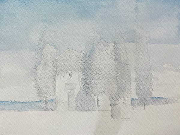
Initial Wash
What I did: I lightly made the outlines of the primary shapes, and then used “Ocean Blue #07,” to lightly layer the sky, distant hills, trees, and shadow shapes. With a #10 brush loaded with water, I washed the area and let it dry.
What I’d Do Differently: Notice the uneven areas in the sky? This is because my brush was too small and I was not able to deliver an even wash to the entire sky area in one pass. On the next try, I’d use a larger #14 watercolor brush, which would hold more water and allow me to work the entire area in one attempt.
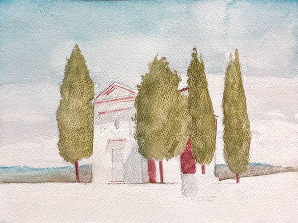
Mid-Tones
What I did: I used “Green Grey #09” for the distant hills, “Ivy #11” to block the mid-tones for the trees, and “Chestnut #13” for the red shadow areas. The #10 Sable Brush worked well to create an initial wash and build light textural brushwork. After the initial wash dried, I applied a layer of dried pencil to create a dried textured effect on the rough tooth of the paper.
What I’d Do Differently: The color in the distant hills is not creating the effect I would have liked. Given a second try, I would create a stronger initial layer of “Sky Blue #07.” This would create more atmospheric distance. In the shadow areas of the building, I would use “Cool Brown #13.”
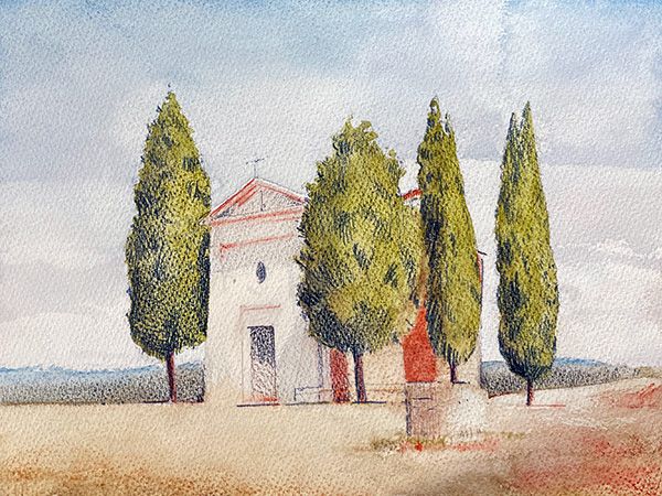
Final Study
What I did: I used a wash of “Sage #12” on the ground and chapel to ad warmth. Detail, texture, and shadow was added using hatching with a dry “Shadow #05” pencil.
What I’d Do Differently: The reddish shadow areas are too strong, so I would start with a stronger layer of “Sage #12” and a lighter layer of “Chestnut #13” to indicate the shadows.
What Was Learned
Graphitint on watercolor paper is a compelling pairing. The resulting image has a compelling light quality and texture, but I need to better understand the colors and how to layer them effectively. I enjoy building layers of hatch marks and details on top of the colored washes and look forward to working further with these materials!